
Reservation redesign
Office workers needed help reserving spaces using the Activate platform.
By displaying available time slots by duration and start time, booking a room became 3x faster.
Background
Booking space is one of the Activate app's most used features. Think large meeting spaces, breakout rooms, and private phone booths.
Customers and internal teams complained about the glitchy user experience. Despite this, Activate users made over 1,000,000 reservations in 2022.
Improving the booking experience will reduce customer turnover and increase company and client revenue.
We are successful when customers create bookable content each month, and users can easily reserve space.
My role
Product Designer
User research
Visual Design
Prototyping and User Testing
November 2022 - April 2023
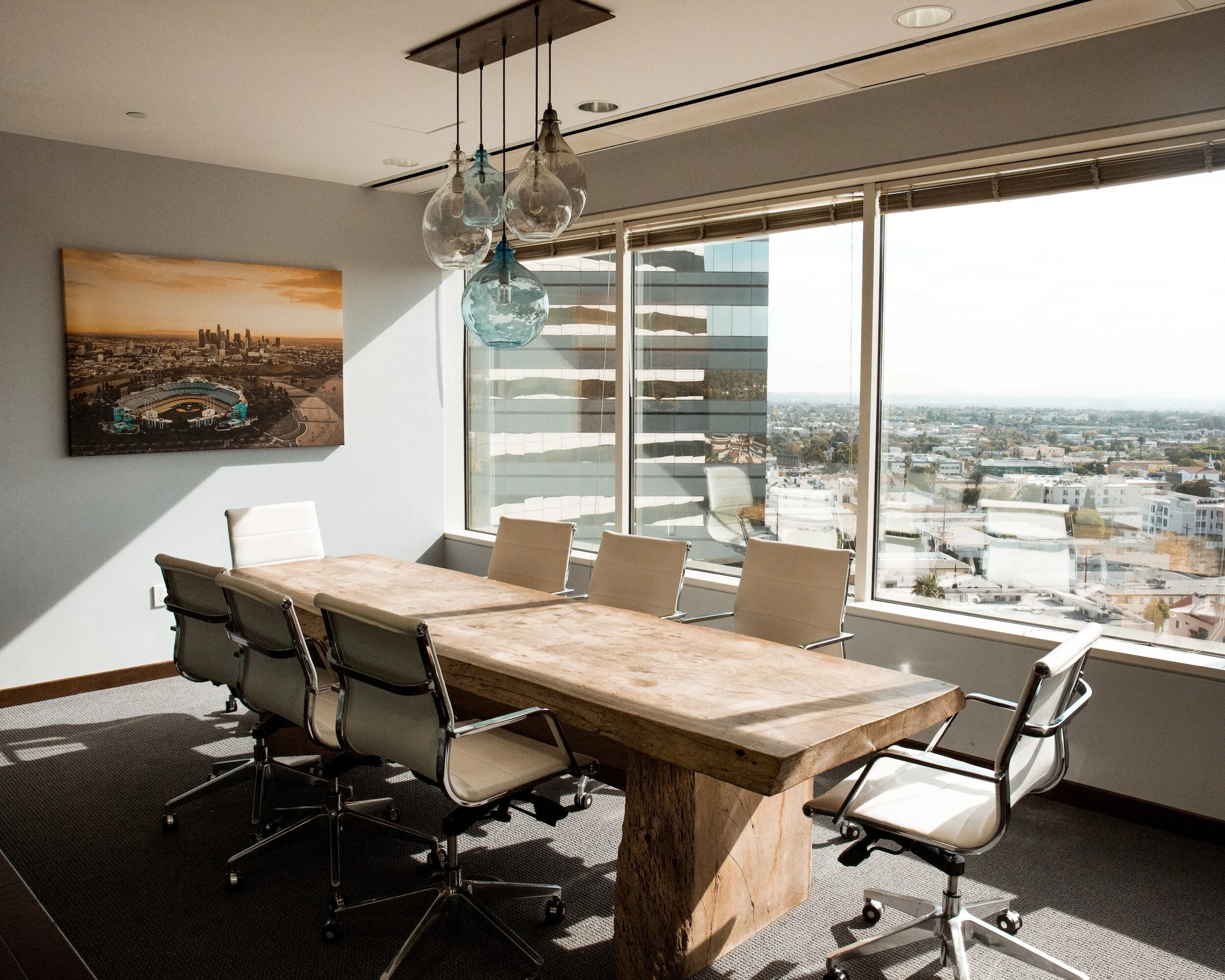
Booking a room with VTS Activate
Problem - a poor user experience
A piece of content can use one of two booking types: an interactive slider, or a list of time slots.
Most reservable content uses the slider, customers like how it looks. But the slider is glitchy and doesn’t behave as expected. There is a strong push from the executive level to do away with it.
The list of time slots booking type is easier to use, but logic is broken and it can’t display all available times. The UI makes it difficult to see all of the options.
Interactive sliderList of time slotsUnderstanding user expectations
I knew the interactions were poor, but I wanted to understand exactly what users liked and didn’t like.
I set up two user tests on the live app. One test used the slider and one used time slots. I showed 10 participants 2 conference room pages, and asked them to make a booking. I then asked how easy the task was out of 5, 5 being easiest.
Users got frustrated because of weird implementation and the slider being too small to use on a phone. Overall they did prefer the flexibility of selecting a time at any increment.
Completion rate: 80%
Perceived ease of use: 2.8/5
Average time to complete a booking: 59s
Interactive slider
List of time slots
Users like the simplicity of the list and one-click booking. They got annoyed when they realize they are limited to one duration, as expected.
Completion rate: 100%
Perceived ease of use: 3.6/5
Average time to complete a booking: 28s
Our users want to book the exact time they need, and prefer to see all of their options at once.
How do users make bookings elsewhere?
SpaceOS (Competitor)Condo parking app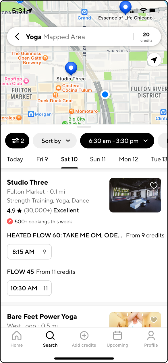
classpassUsers already have an idea of when and how long they want to book when they start a reservation process. Most technology supports that mental model.
I want to show the user options that fit their schedule, rather than browsing all available times.
Joan (competitor)OpentableDesigning a solution
Early conceptingI used selectable chips in my first iteration. I liked that they are easy to read and a common pattern for selecting a time.
I set up an interactive prototype test on Lyssna, and asked 25 participants to reserve a conference room for 2 hours. Then I asked how easy they found the task from 1-5, with 5 being easiest.
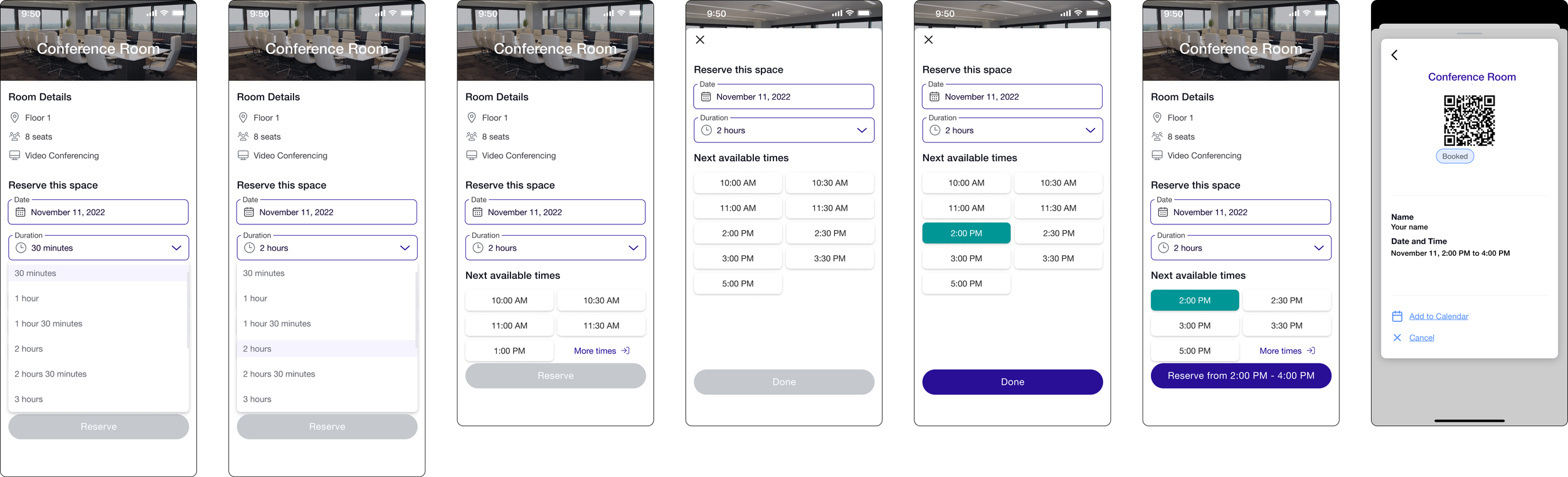
First iterationTest results
Perceived ease of use: 4.84/5
Average time to complete the task: 52s
Misclick rate: 47%
Users got tripped up when they tried to select a duration. The dropdown isn’t great for mobile, I used chips for durations in the second iteration.
The risk with chips is that there could be a lot of them in a single day, meaning a lot of scrolling. My designs display only the next 6 times, it reduces noise and presents the most relevant options. Other options are easily accessible in a sheet.
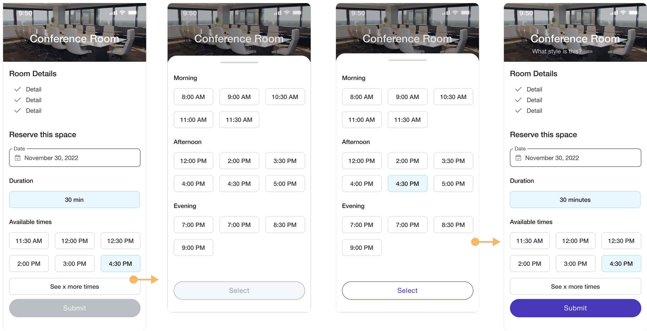
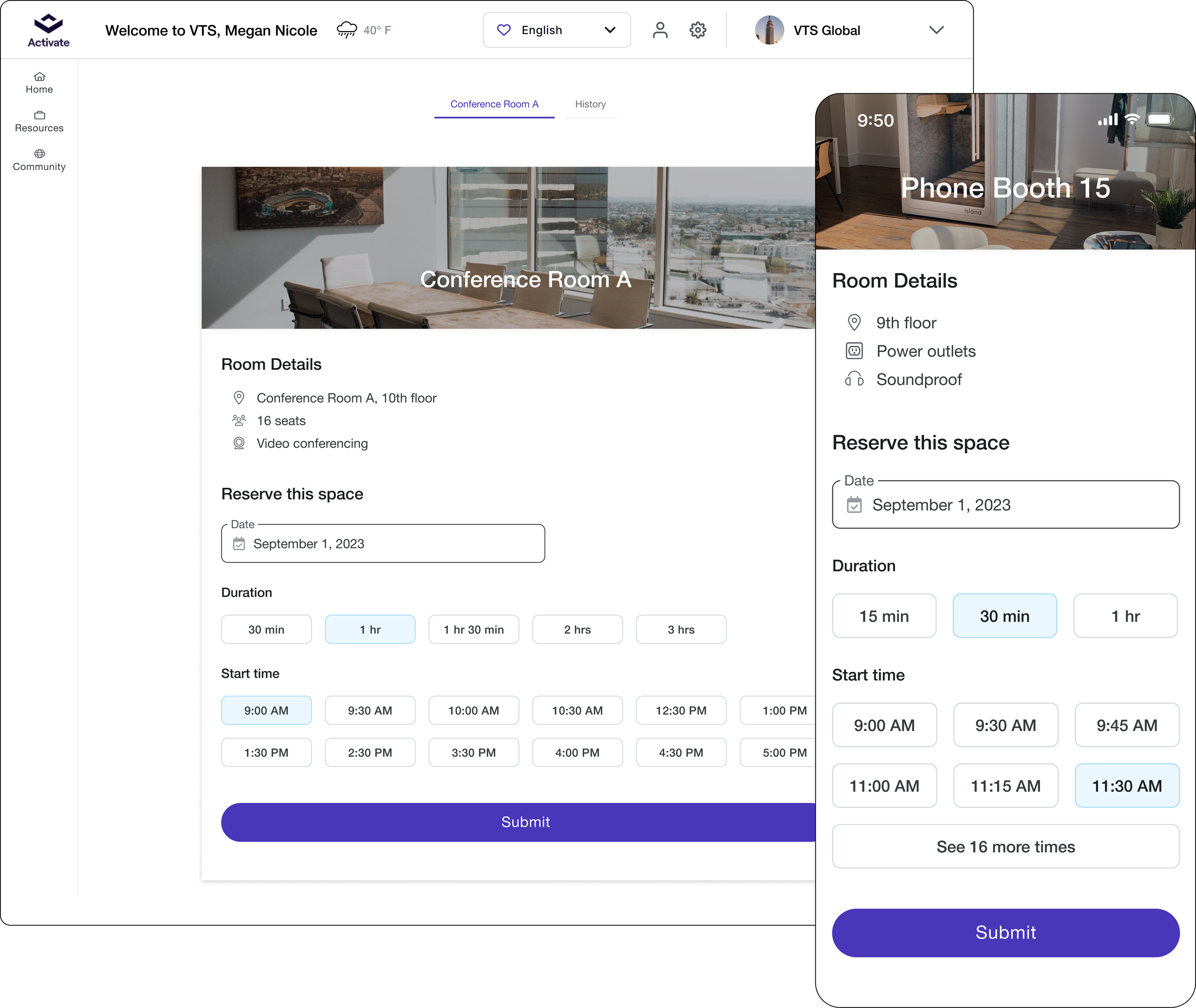
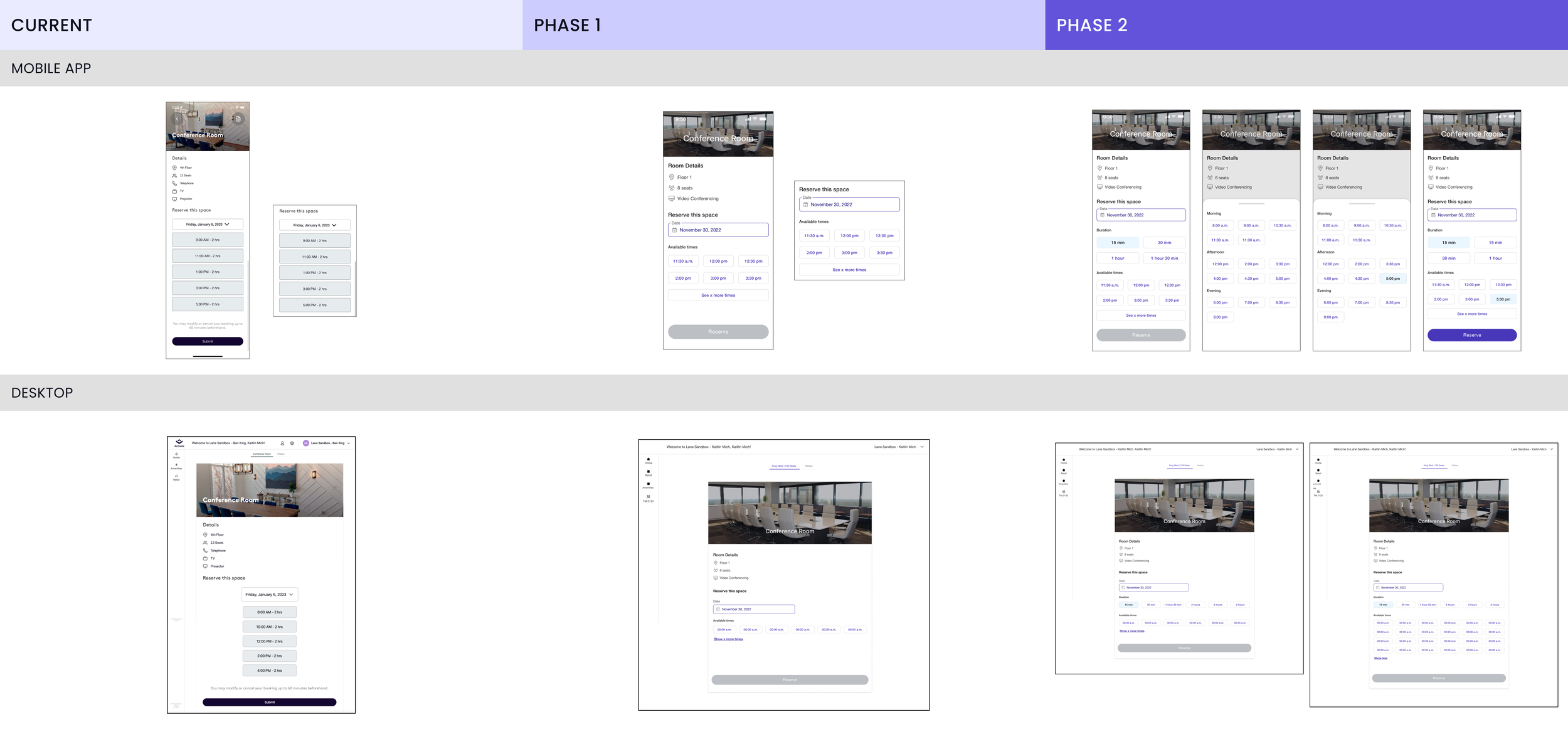
Second iterationA solution in phases
Phase 1 introduces components from the new Activate design system. The functionality slightly changes from the current design, and it displays a single duration.
When I tested Phase 1 against my benchmark, the scores spoke for themselves. Average completion rate rose from 80% to 100%, ease of use rose from 2.8/5 to 4.9/5, and the time to complete a booking went from 59s on average to 19s.
Phase 2 is when we will refine the experience. The admin will be able to customize duration options for each space. Are phone booths usually booked for 15 and 30 minutes? Can the lounge only be booked for 2 -4 hours? Our stakeholders would get the customization options they wanted in phase 2.
Aftermath
The Product team encouraged implementation managers and customers to use time slots when they create new app content.
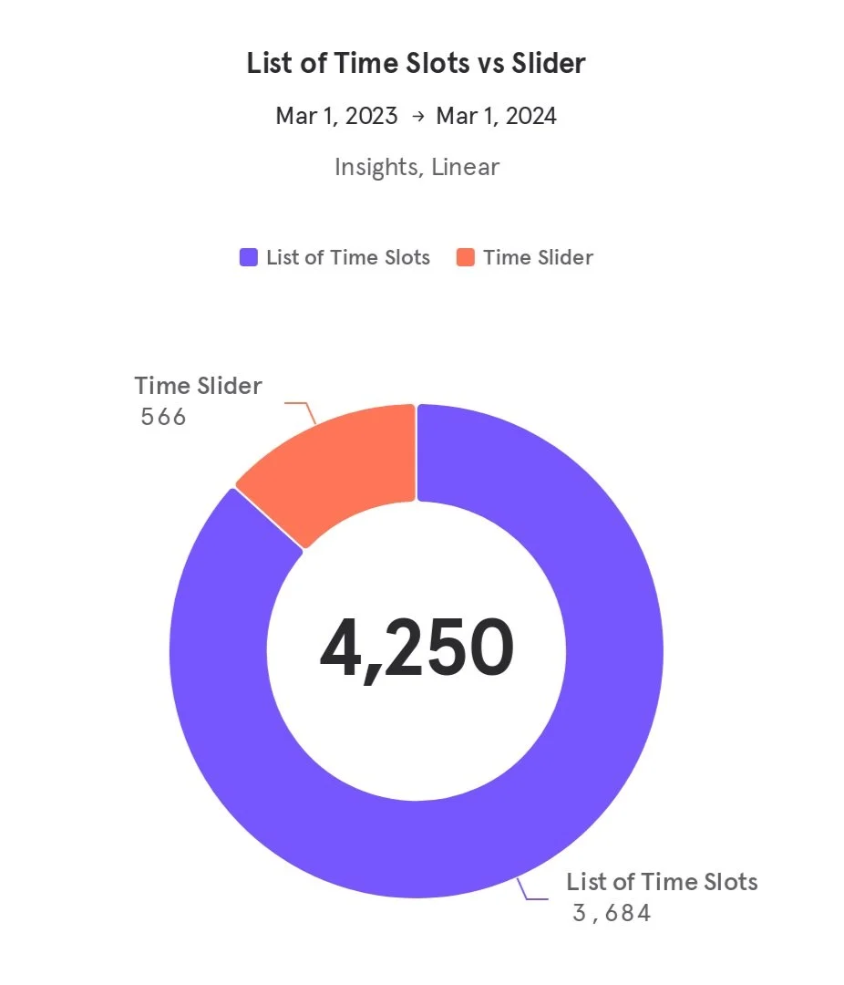
Properties with the most bookable content adopted the new feature in the first year. End users reserved 7.5x more amenities using time slots than the slider.
Unfortunately, roadmap reprioritization delayed Phase 2. I used the extra time to fine-tune user flows, gather customer feedback, and work on new components.
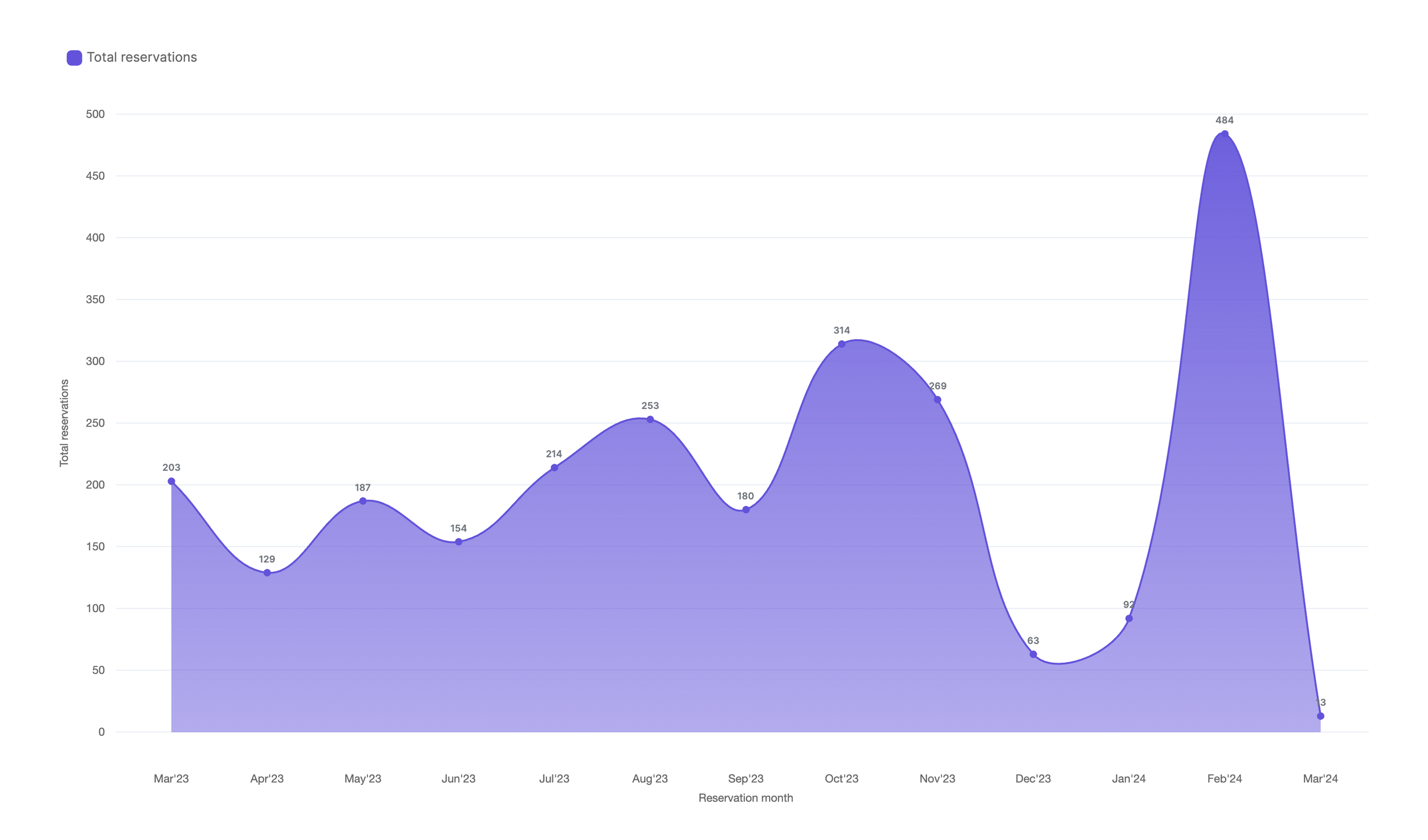
Monthly time slot reservations at a high engagement customerLearnings
I'm used to using tools like Lyssna (formerly Usabilityhub) for near instant results. But this project forced me to do in-person usability testing. The slider was impossible to recreate with a clickable prototype. I sat down with friends, family, and colleagues to hear their frustrations live and gain user empathy.
Read another case study