

Improve engagement by waiting
Office properties and companies want to keep workers happy, but how do they do that?
Buildings are offering fitness classes, chair massages, complimentary breakfasts, even bingo happy hour. This is all futile if you don’t know what your tenants actually want.
By adding waitlisting, popular events and classes will stay full. Property teams can track sign ups, and use engagement data to plan future programming.
Problem
Office space vacancy has reached an all time high post pandemic, and office properties are still struggling to adjust to shifting supply and demand.
Enter co-working spaces. These tenants bring in an influx of workers who want to be in an office, just on their own terms. Like the building as a whole, the tenant must invest in tenant engagement to attract new members and fill desks.
Without understanding what tenants want, on-site teams can’t effectively plan programming and may waste time and funds on unpopular events and classes.
Using waitlists, popular events and classes will stay full. Property teams can track sign ups, and then use the engagement data to plan future programming.
My role
Product Designer
User research
Visual Design
Prototyping and User Testing
February - August 2024
Limitations
The customer and specific requests
An established co-working customer had a custom app, Zo, for conference room bookings and event RSVPs. They wanted to migrate those users onto our Activate app, but waitlisting was a nonnegotiable. This contract was a catalyst to build a waitlisting feature that had been in the backlog for years.
I had to find a balance between this customer’s specific requirements, and what would be best for the majority of our users.
Strict deadlines
This project was dropped on my desk with a 6 week deadline and no formal kickoff. Copying the flows from the Zo app would have been the easy thing to do, and we could have hit the ground running. I pushed back and requested more time from the client for discovery in order to build a better solution for their users.
Understanding waitlisting
The customer app
Even though I wasn’t going to replicate it, I used a screen recording of the Zo app to conduct a usability test. The goal was to establish a baseline and understand what they were working with.
I asked participants to join a waitlist and score the experience from 1-5 , with 1 being difficult. It scored well with a 4.3/5 overall, but had a lot of clicks and felt very clunky.
How do other apps handle waitlisting?
I didn't want to reinvent the wheel, instead I wanted to meet users’ expectations. The use cases I was solving for were event RSVPs and and fitness class reservations, so I compared apps in similar spaces.
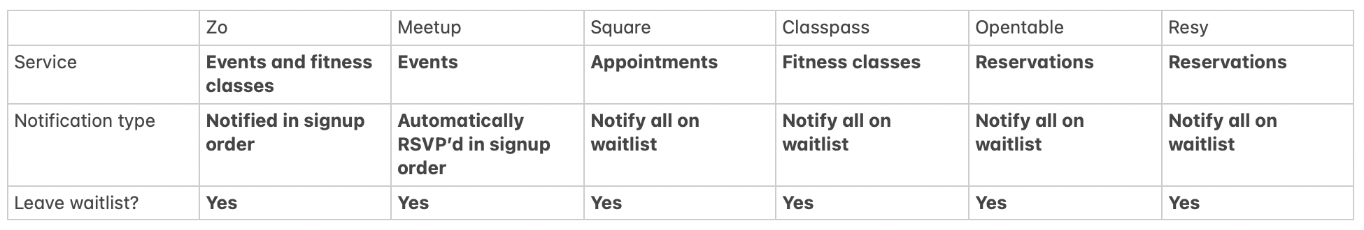
The majority of apps I looked at sent notifications to everyone on the waitlist if there was an opening. This gives everyone an equal opportunity to claim a spot.
Alternately, the Zo app notified users in the order they signed up. They would have an exclusive 2 hour window in which they could claim a spot before the opportunity was passed to the next on the list.
I had an assumptions that notifying all on the list was the better experience. I met with engineering, and from a technical perspective, it would be easier to build and have less risks as well.
Convincing the customer
I had to convince the customer to move forward with a “notify all” system. I presented my findings to our customer to understand why they used the notification style they did.
This sequential waitlist is inherently flawed. In this example I used, William signed up first for a spot in the yoga class, but was at a disadvantage since a spot opened up after he fell asleep.
After some back and forth, I was able to get the customer on my side. They agreed that sending a notification to everyone would more likely result in full classes and events, and be a better user experience for their tenants.
Prototyping & Testing
The user must be able to:
✔ See which time slots are full
✔ See a clear CTA to join a waitlist
✔ Receive an email notification if a spot becomes available
✔ Easily remove themselves from a waitlist
First draft to spark a conversation
These were first drafts that I shared with stakeholders in an informal review. I wanted something to show to spark a conversation. I knew I wanted a better way to indicate a time slot was "FULL" so this text was a placeholder, I was mainly playing around with the text and alert style.
They absolutely wanted the word "waitlist". This was their only must have item, so I took this and ran, making design decisions to align with our design system.
Join a waitlistClaim a space via emailRelaxing assumptions
Based on feedback I made the following changes:
Added waitlist text to CTA
I had assumed there wasn’t time to redesign these chips fully - so I inserted “Join waitlist” text inside the chip itself
Changed alert to a toast component already in the design system
I wasn't happy about how imbalanced this was, it would be more common for a time to not have a waitlist than to have one, so it would often be lopsided. But I was under the impression that I couldn’t make a bigger redesign because of time constraints. I reviewd this flow with design leads, and we agreed that it would be worth the higher lift to make more drastic improvements.
Testing a clear call to action
This third version felt much better. I modified the list and gave each time slot a "Join waitlist" or “Select” action.
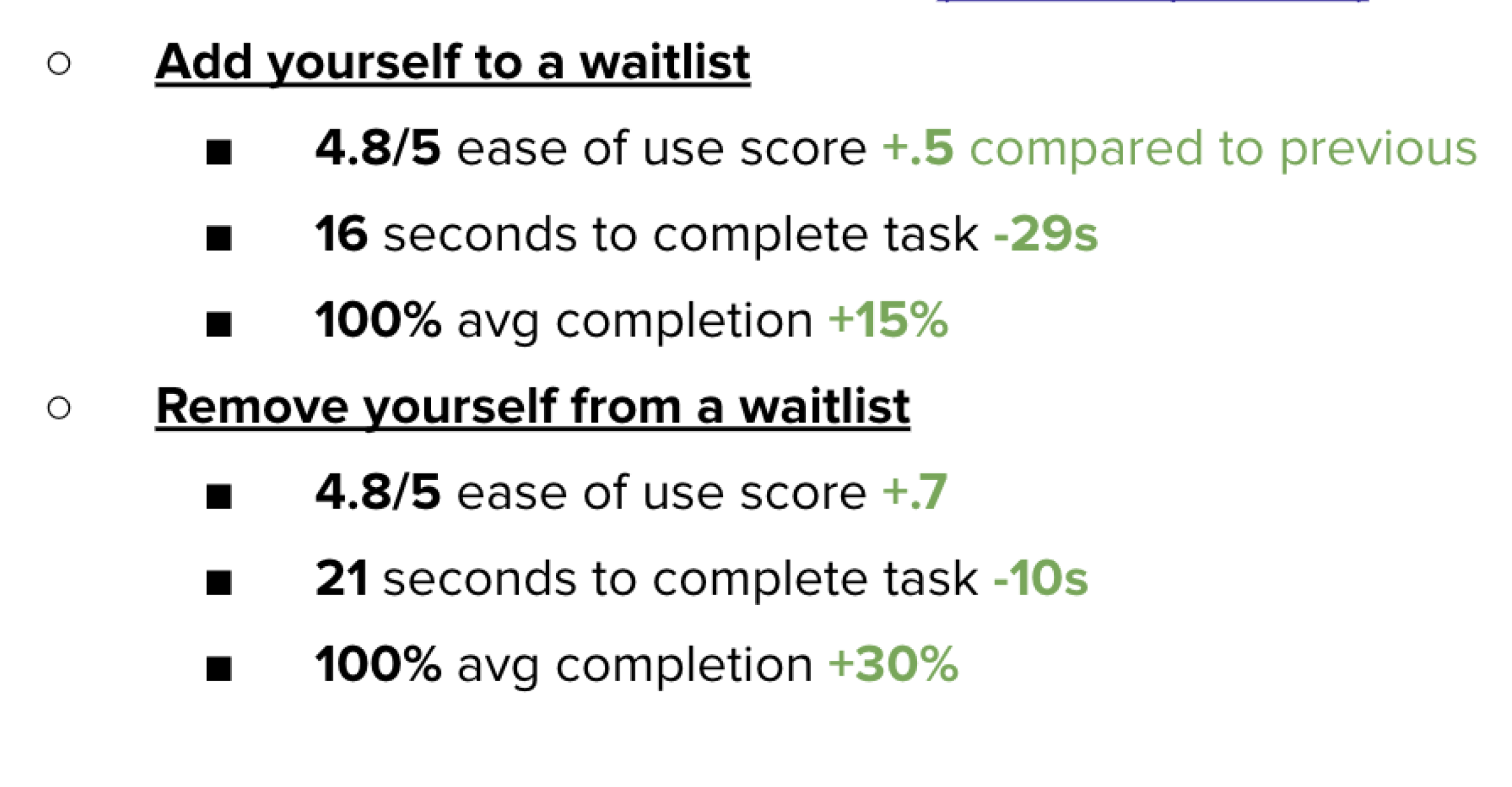
I tested this prototype with 5 users to identify any usability issues:
It took on average, 16 seconds to find the correct time slot and join the waitlist.
And users had a perceived ease of use of 4.8/5 - a 10% improvement from the Zo app baseline of 4.3/5.
Simplify Simplify Simplify
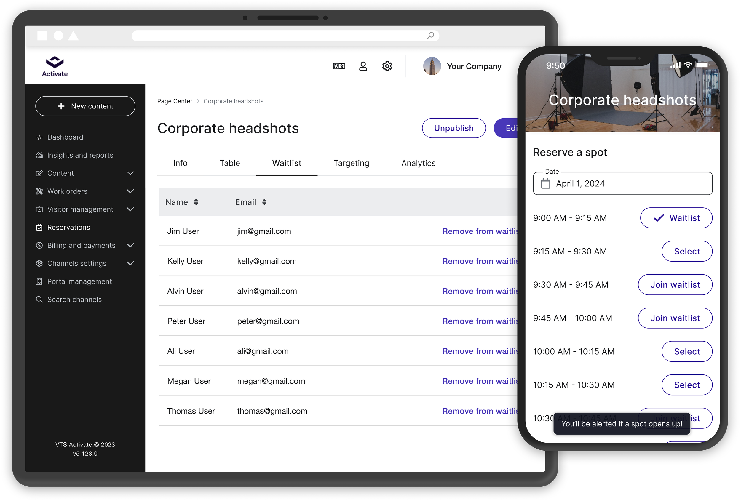
A few tweaks to get to the final version. When joining a waitlist, a user only has to click “Join waitlist”.
This seemed obvious, but our existing components didn’t support this action. To accomplish this, I created a new toggle button component and added it to the design system.
Outcomes
Handoff went smoothly as I kept the team in the loop throughout the design process. I met with the developers working on waitlist at least once each week to continuously check interactions and UI consistency. This communication helped move the project along swiftly.
The waitlist feature launched in late July. Our customer success team worked with the client to turn on waitlisting in 3 buildings to start. We saw 5 of their most popular fitness classes go onto a waitlist in the first 2 weeks post release.
I really enjoyed this project, it was a culmination of everything I had worked on in previous year. I built upon the reservation and event flows, and finally designed a UI that I was really happy with as we had the time to do it right.
I also enjoyed the back and forth with the customer, I was proud to give them a user experience that was better than what they started with.
Read another case study